


Using the daily jab rollout and the daily excess deaths for any given country during the Covid era to see if any patterns emerge. I went ahead and did 2 to start you off.
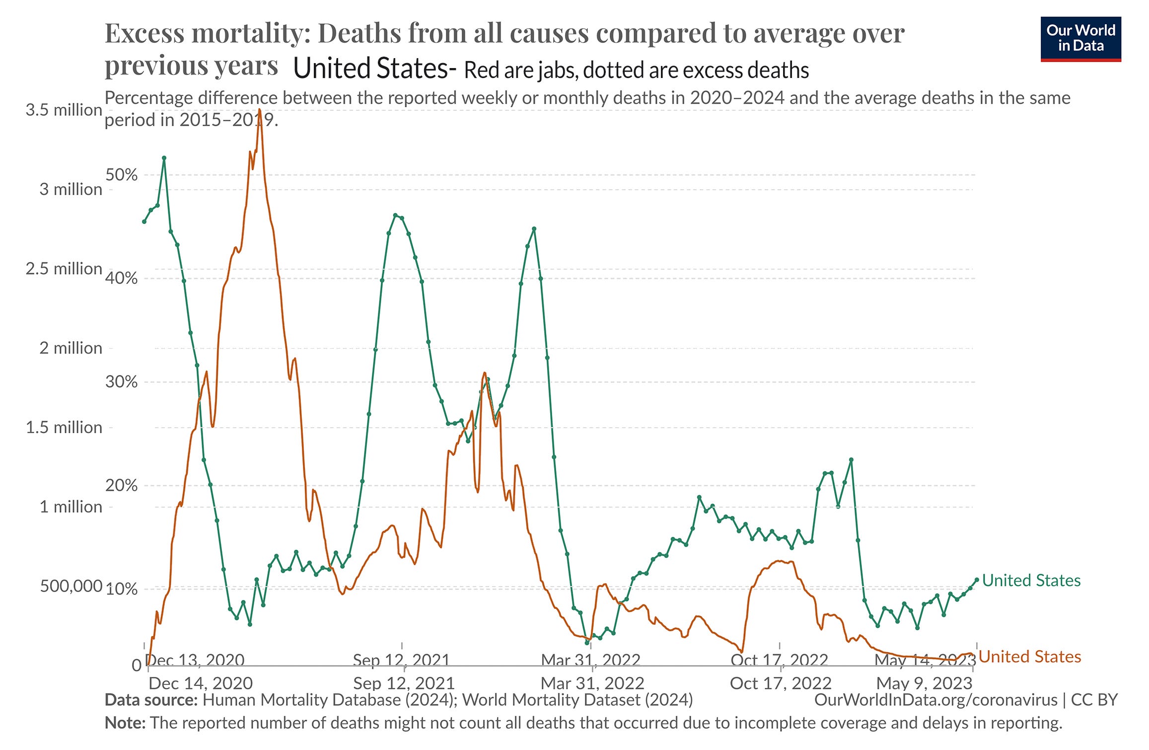
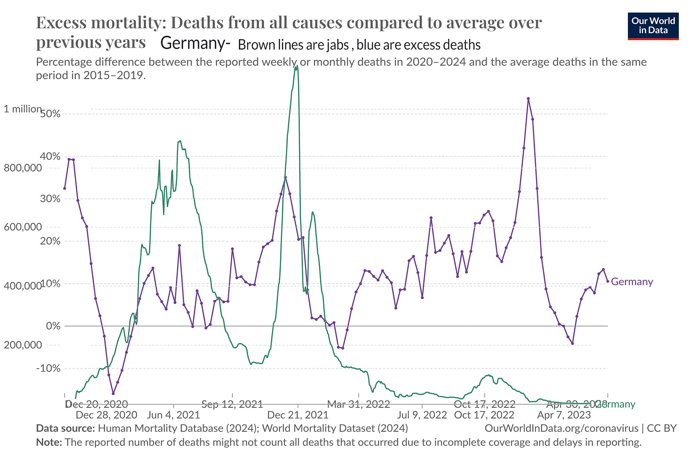
At the very least, this seems to be something that some government body would be looking into, but nope. I mean, seriously looking into, not just saying that they know something they can’t show us that disproves the relationship.
BTW, I had to match up the dates, then download each set of data , then remove the white background from the jabs image, as well as the title and the information at the bottom. Helps if you have a graphics program that can do that. The numbers on the left are for the jab rollout and the percentages on the left are excess mortality.