


To run with a culinary analogy: food should be judged by taste, smell, and texture, but it’s usually graded on looks. That’s how places like Chili’s flourish while serving attractively plated dog food buried under cheese.
Which brings me to the point of this post. There’s an exceptionally important Substack called The Virology Control Studies Project, doing genuinely world-changing work. It seems to have undergone a partial rebrand lately, but I’m not convinced it’s doing them any favors. Some of the core visuals are fine, but the overall theme doesn’t carry through. It’s missing that crucial sense of continuity.
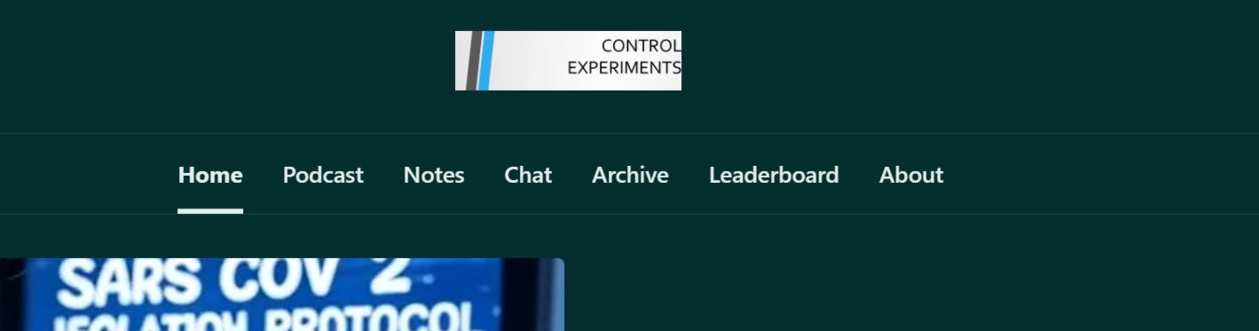
Here’s a good example of what I mean: A strong header image that’s currently being let down by poor implementation. It’s mismatched to the required hero dimensions*, and the face shot, though decent, is undermined by a background that’s unfortunately too similar in tone to the subject.

*This is most likely due to unclear usage instructions and other inherent limitations of Substack’s formatting editor. It allows one to add images that are then used in more than one place, with differing end point dimensions.
Also, of course, when i get to the page, I am seeing things like this.
So, Jamie Andrews I’d like to volunteer/pro bono/no cost… to do a complete rebranding for you. This is what I threw together in under 5 minutes.

BTW- This is just a quick mock up using fading virus icons to symbolize the disappearance of evidence and therefor the existence of viruses laid underneath a text treatment showing the importance hierarchy of each of the words, (controls being the most important aspect) done in medical blue with medical ish looking typeface. Like I said, under 5 minutes. I would spend considerably more time on the production ready graphics.
And by complete rebranding, I mean everything from your profile pic, to logo/headers/favicon, to all the digital repeating graphics, to letterhead, business cards, and the rest of the IRL server bits.
It is unfortunate that we really do judge all books by their covers, but that is built into the system. Just try reading a whole book in Barnes and Noble before deciding to purchase it. They will throw you out, no matter how fast you read. Bastards.
Let me know if you are interested.
Author’s Note
Substack, in its infinite wisdom, still doesn’t allow images in comments. A recurring thorn in my side. This post really belongs as a simple comment on a VCSP article, but without the accompanying visuals, it would make absolutely no sense.
So here we are again: I’m forced to publish a full post just to make a small point and offer some unsolicited design help to someone I genuinely respect. Unfortunately, it may come off as condescending or at least mildly annoying to the person it’s meant to support. My apologies in advance.